 In order to give me ideas and inspiration to create my own logo to represent my record label 'VAC Records' I used the internet to source images. Using an search engine I researched 'indie record label logo' as this is what I wanted to replicate and therefore present. I found lots of unheard of record companies whose logos were all similar in the fact that they were artistic, quirky, bold, cartoon-like and abstract. The general colour scheme included black and white, with sometimes bursts of random neon colours. In addition to the companies name an icon was added such as cartoon dogs or plants to make the logo more iconic and rememberable, which serves the purpose of a logo.
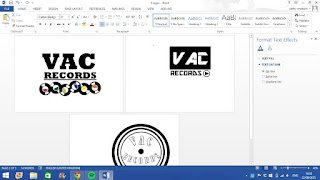
I created three different logos that I will put to my audience to gain feedback on their favorite design, via social media. I created the three logos separately using Microsoft Word which is a format I am very comfortable using. I had access to a number of shapes that I could customize according to thickness, colour and size and as well as a range of different font. I stuck to a monochrome colour scheme throughout, with subtle pops of colour in one of the designs. I feel all the three logos are quirky and reflect my companies in promoting indie pop music through the colours, images and fonts used.
MY THREE FINISHED LOGO DESIGNS:
SOCIAL MEDIA FEEDBACK:

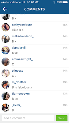
I took to Instagram and posted a picture of the three logo designs I created and asked people which was there favorite. I received a lot of response where the majority voted that B was their favorite. Without the social media feedback I was unsure what logo to use as I didn't know which design represented my company the best. However I agree with my feedback that B is the best logo design as it is bold, colourful, clear and precise - everything a successful logo should be.
FINAL RECORD LABEL LOGO:
The aim of my record label is to support up and coming artists from the Indie and Indie Pop music genres. Supporting the artists involves distributing and marketing their products well in order to reach their niche audiences. VAC Records is a reliable company that is professional and successful in their work. The chosen logo triumphantly reflects that my company is dominantly musical based (from the mini record icons) and adventurous with the artists they sign and the music they produce (from the bright colours and bold font).


No comments:
Post a Comment